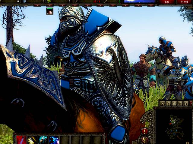
Spellforce 2 was released in 2006 and will be 8 years old by april. Nevertheless, the third add-on of the series shipped a month ago. Talk about a long seller!
Of course I’m attached to SF2 because I wrote many parts of its engine back then. This time I was briefly involved to help the developers include my attribute-less normal map algorithm. The original SF2 did not have any normal maps, and therefore none of the original art assets comes with tangent space information. This is an ideal scenario to pimp up the visuals without touching the geometry, simply by making a shader change and adding normal maps.
So over the last weekend I finally found the time to play DOTP this weekend and I am pleasantly surprised by the whole package! Considering the fact that publisher Nordic Games could not commission the original developer, this is quite an achievement.
The new missions are engaging and the spirit stays faithful to the original. Some puzzles are hilarious and you even get to visit the gods of Eo themselves. I see very creative usage of the existing technology, for instance, its apparent that the existing waterfall material was used on an egg-shaped object to make it look like a transparent magical cage.
Other modifications that I can see they did:
- They added screen-space dithering for shadow maps. Looking very nice!
- They added some kind of rim-shading, where the effective normal is “bent around” the object. However some objects have this flagged where it shouldn’t, especially walls and fences with planar faces. It gives them the illusion of translucency when viewed at a grazing angle.
- They added 16:9 and 16:10 aspect ratio. Sometimes however the old code is leaking though, for instance when icons are displayed inline with text in quest logs, they’re stretched.
- They must have changed the way overbrightness and bloom works. It now appears differently colored in different directions … weird but also cool.
- The background now gets blurred and desaturated when the user opens a menu. However the blur is slightly off-center as the image seems to move a bit when you open a menu. Maybe they tapped into the dreaded pre-DX10 half pixel offset.
I’m being to nit-picky. Overall, the whole add-on is well done!
